


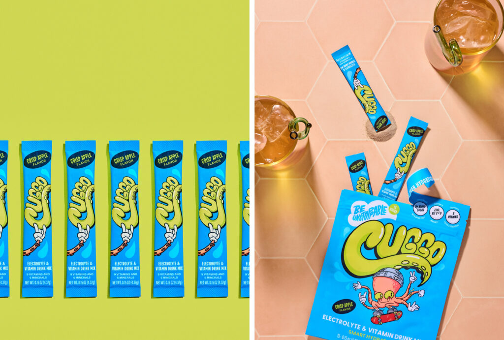
CUGGO is an apple-flavored hydration drink designed for kids. The goal of this shoot was to make it feel bold, refreshing, and genuinely exciting to reach for. We created flavor-forward product photography filled with movement and playful energy. The result is a versatile library of hero visuals for their updated website, plus scroll-stopping content for social.
The Goal
This shoot focused on creating hero images for CUGGO’s Crisp Apple flavor. These visuals were designed to anchor their updated website and provide flexible content for social.
We wanted to:
- Position CUGGO as a fun, go-to hydration drink for kids
- Highlight the Crisp Apple flavor in a way that feels fresh and instantly recognizable
- Create bright, eye-catching visuals that stand out in-feed
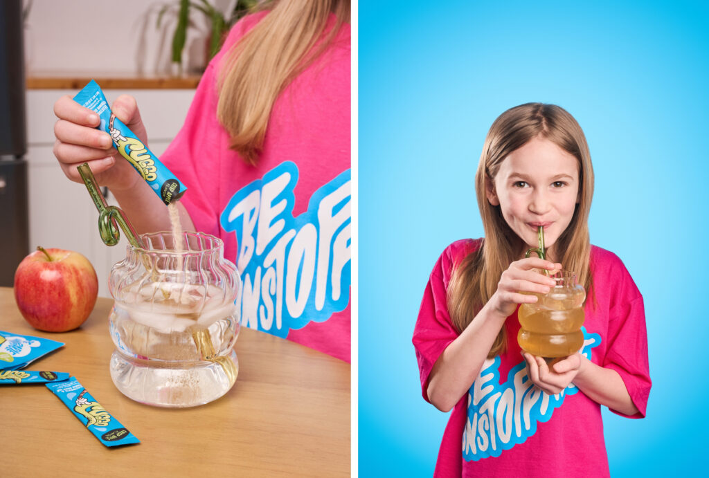
- Capture a mix of polished hero images and more playful, lifestyle-driven moments
Creative Direction
The visual direction centers on bold, color-forward setups that reflect both the flavor and personality of the brand.
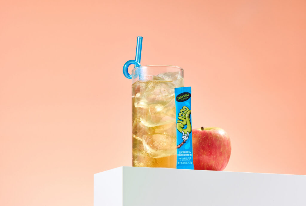
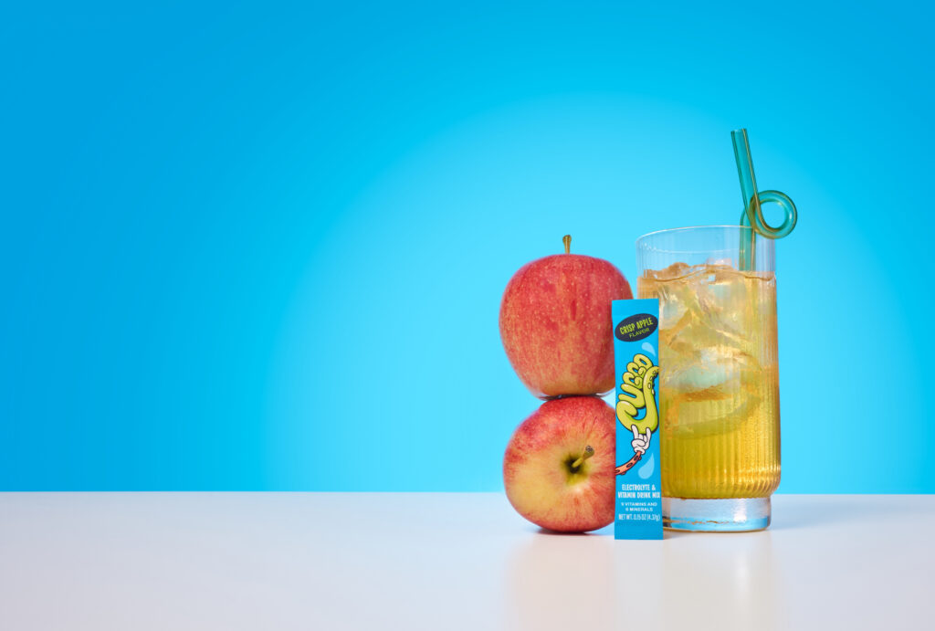
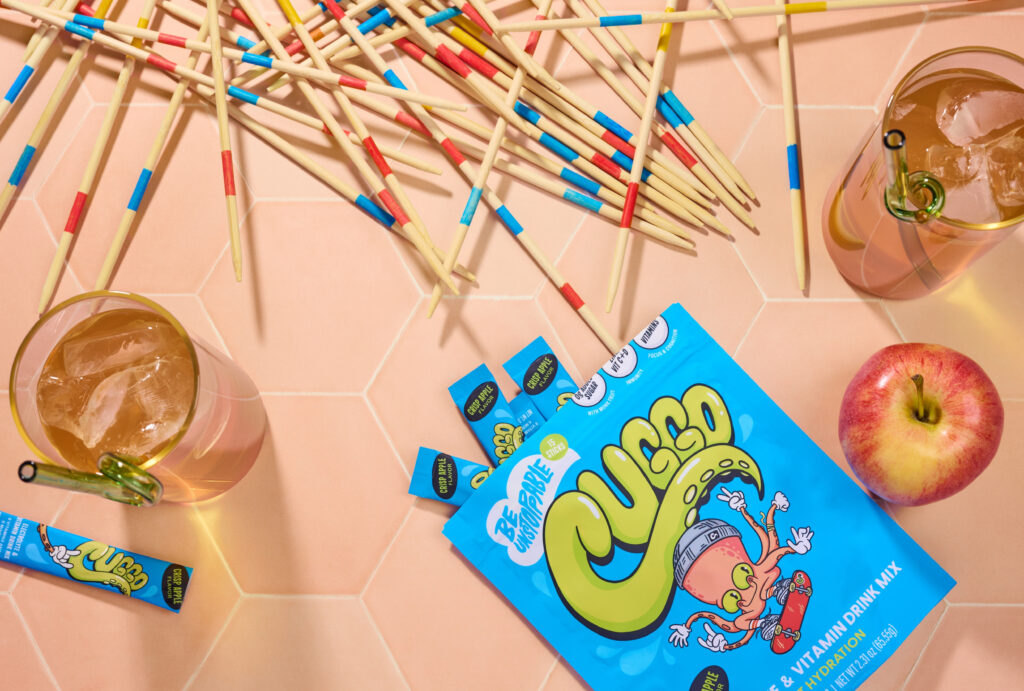
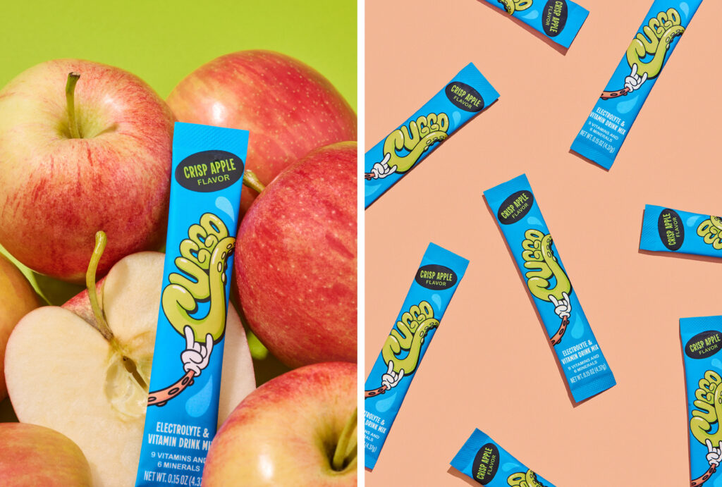
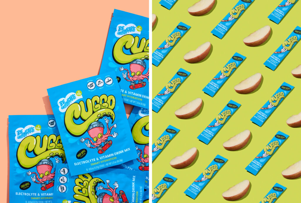
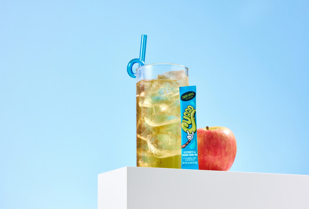
To bring the Crisp Apple flavor to life, we incorporated Fuji apples throughout the shoot, adding a natural and recognizable element to each composition. This approach leans into flavor-forward product photography, using real ingredients to make the flavor instantly recognizable and visually engaging.
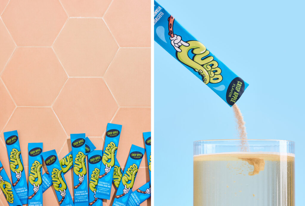
To complement the color palette, peach-toned tile pulls out the warm accent color in CUGGO’s octopus character. In addition, background textures like tile add subtle texture and depth.
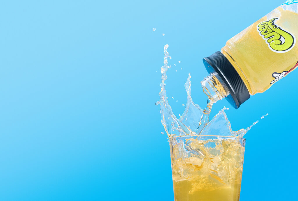
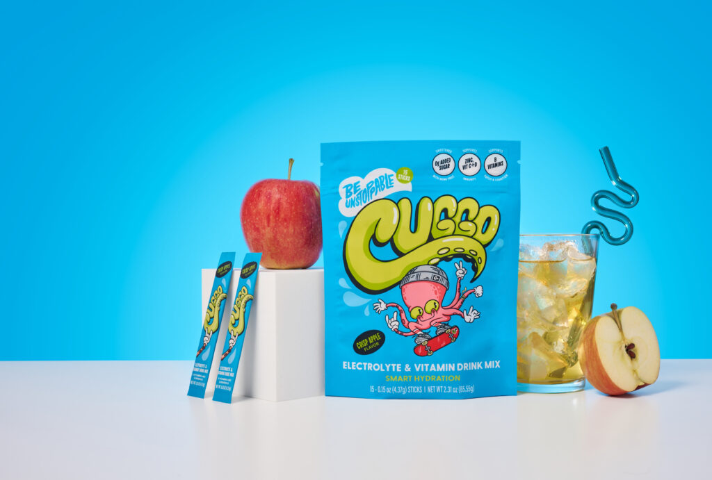
Clean, graphic compositions keep the focus on the product. To introduce energy, we incorporated motion through pouring liquid and shifting ice, reinforcing that refreshing, just-mixed feeling.
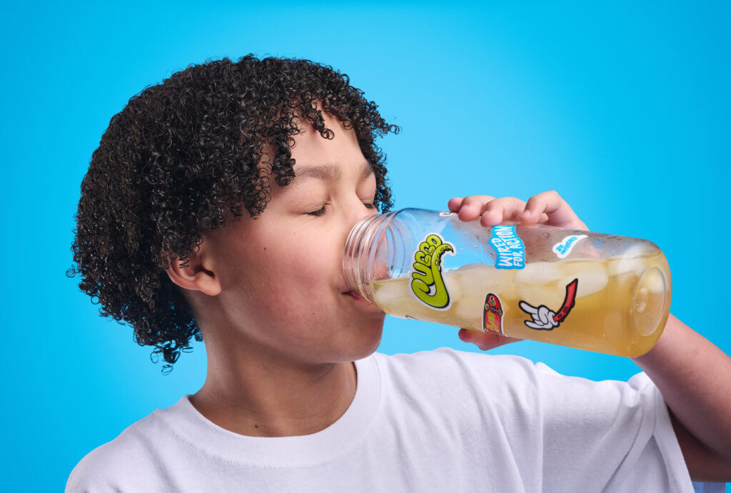
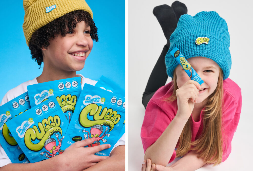
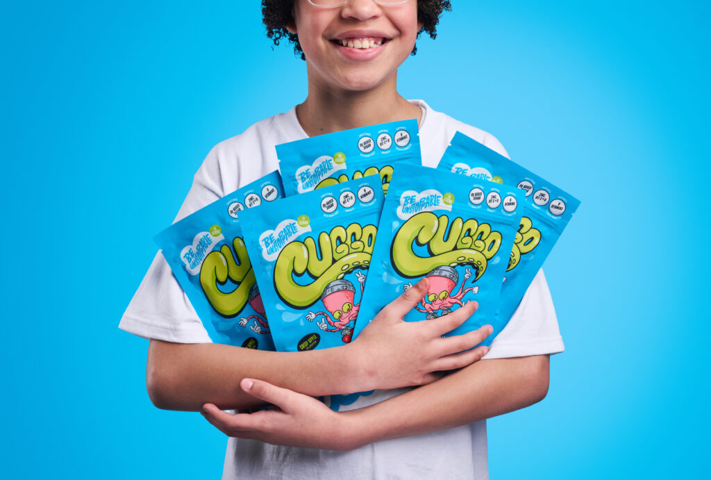
Finally, we included a select set of images with kids in a lifestyle setting. These moments make the brand feel more relatable and expressive while staying visually consistent with the overall shoot.
The Strategy
Every element of this shoot is designed to make CUGGO feel fun, approachable, and easy to reach for, especially for a younger audience.
- Flavor cues (Fuji apples) instantly communicate taste without needing explanation
- Bold color blocking helps the product stand out quickly on busy feeds
- Movement and action create a more engaging, sensory experience that feels refreshing
- Clean, simple compositions keep the focus on the packaging and make assets easy to use across web and social
- A mix of studio and lifestyle imagery gives the brand flexibility while still maintaining a cohesive visual identity
The result is a gallery that not only feels cohesive, but functions as a versatile content library the brand can continue to pull from across multiple platforms.
If you’re a beverage or snack brand looking for bold, strategy-driven visuals that feel fresh, fun, and built to perform across your marketing, this is exactly the kind of content we create.
Ready to get started? Let’s bring your next project to life.
