


Candy brands don’t have a color problem. They have a visibility problem. When every package on the shelf is loud, bright, and competing for attention, bold alone isn’t enough. If everything is eye-catching, nothing actually stands out. That’s where high-impact candy product photography comes in.
This kind of imagery isn’t just about making something look good. It’s about creating visuals that stop the scroll, hold attention, and make someone want the product. This shoot was all about leaning into playful energy, saturated color, and texture to create something that feels just as fun as the product itself, but way more strategic, using Sweet & Sour Candy.
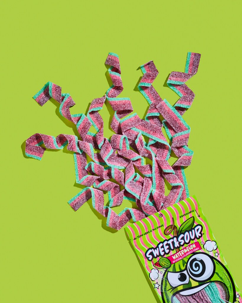
Start with Color That Does the Heavy Lifting
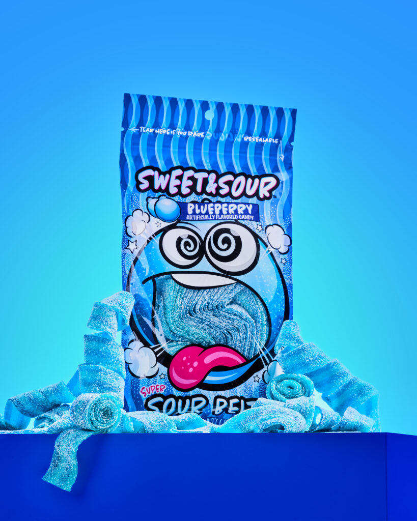
Bright color is expected in candy branding. But controlled color is what makes it effective.
Instead of letting everything compete, the goal is to create contrast and hierarchy.
In this shoot, each setup uses:
- a dominant background color
- supporting product tones
- intentional contrast to guide the eye
This helps the product stand out instantly, whether it’s on a retail shelf or in a fast-moving feed.
Because if someone doesn’t notice it in the first second, they’re already gone.
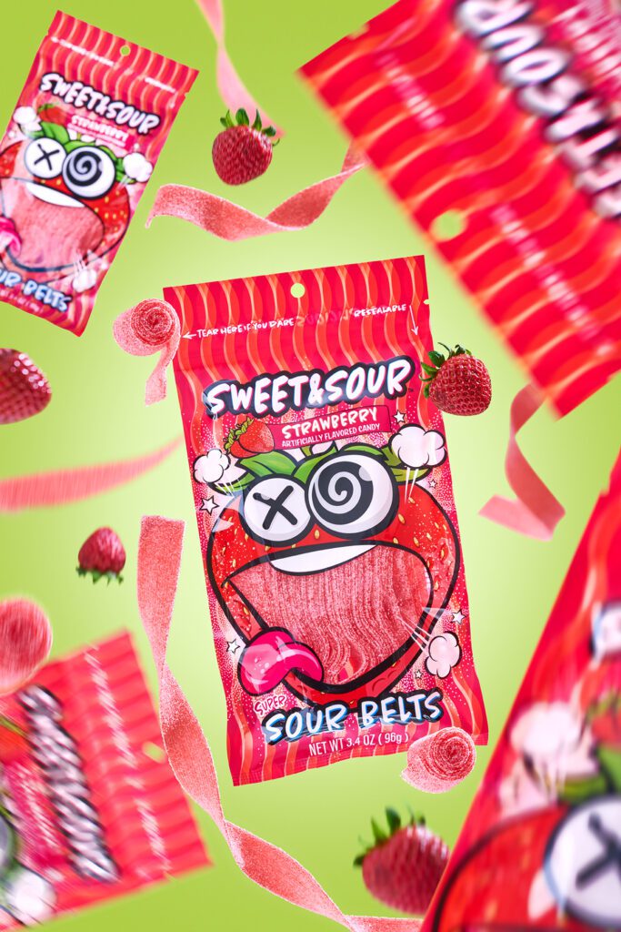
Add Movement to Capture Attention Faster
Static images get ignored. Movement creates curiosity.
Floating packaging, scattered elements, and layered compositions bring energy into the frame and make the product feel more dynamic.
This kind of visual movement draws the eye across the image, adds personality to the brand and makes the content feel more alive. And on platforms like Pinterest or Instagram, that extra visual interest is often the difference between a scroll and a stop.
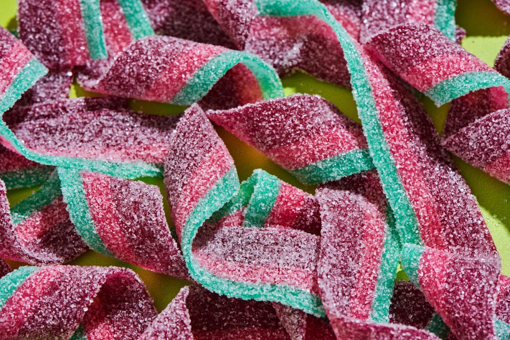
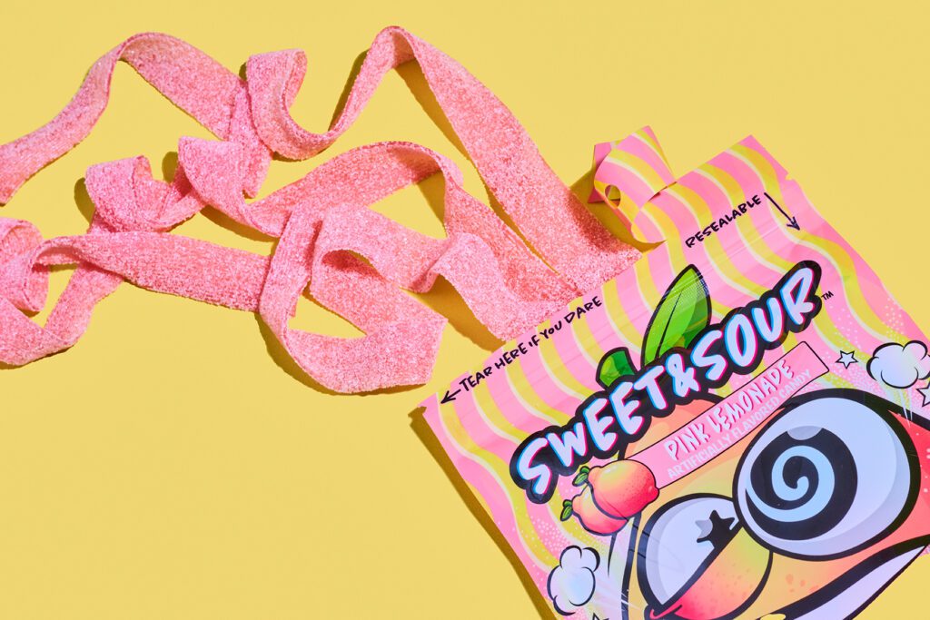
Use Texture to Trigger Cravings
Texture is one of the most underrated tools in product photography.
Close-up details of sugar coating, soft edges, and layered candy pieces help create a sensory experience. Even through a screen, people can almost feel it.
That matters because texture increases perceived quality, it makes the product more tangible and it taps into craving-driven decision making.
If someone can imagine the taste, you’ve already done half the work.
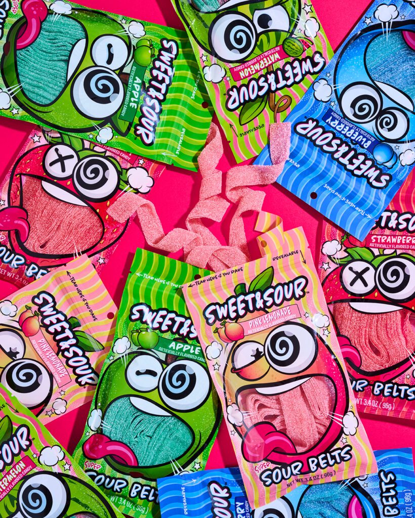
Show Variety Without Losing Focus
One of the biggest challenges with CPG photography is showcasing multiple products without creating visual chaos. The solution isn’t less content… it’s an intentional composition.
By grouping products in structured but playful ways, you can highlight flavor variety, create abundance and keep the image cohesive.
This gives brands more flexibility across marketing channels without sacrificing clarity.
Create Multiple Looks from One Shoot
A strong product shoot should never result in just one usable image.
From a single concept, you can build:
- hero images
- flat lays
- macro detail shots
- lifestyle-inspired spills or interactions
This approach gives brands a full library of content that works across ecommerce, social media, ads, email marketing and more.
More variety… more mileage… more impact.
Why This Style Works for Candy Brands
This kind of imagery is designed to do more than look good. It’s built to:
- stand out in saturated markets
- hold attention in fast-scrolling environments
- highlight product quality and detail
- create a strong, recognizable visual identity
Because at the end of the day, great product photography doesn’t just showcase a product… It helps sell it.
Playful doesn’t mean random.
Bold doesn’t mean chaotic.
The most effective product photography sits right in the middle where creativity meets strategy. And when that balance is right, your product doesn’t just blend in with everything else on the shelf… It becomes the one people actually notice.
If you’re looking for high-impact candy product photography that makes your product impossible to ignore, let’s create something intentional.
